Apr 17, 2026
8 Usability Testing Questions for Your No-Code MVP
Our guide to usability testing questions for no-code apps. Learn the 8 best question types, from SUS to task scenarios, to validate your Bubble MVP.

A founder ships a Bubble MVP on Friday, sends the link to a few prospects, and gets polite feedback by Monday. “Looks good.” “Nice concept.” “I’d use this.” Then the session recordings come in. People hesitate on the first form, miss the main call to action, and get stuck in a workflow the founder can complete from memory in seconds.
That gap is normal. Building the app gives you x-ray vision into your own product. You know which workflow runs after a button click, which repeating group updates the page, and where Bubble’s logic forced a compromise in the UI. New users only see the surface. If the path to value is unclear, they feel it immediately.
For no-code founders, usability testing matters most at the MVP stage because the product still has sharp edges. You are not trying to perfect every screen. You are trying to confirm that the core promise works for a real person with no setup help. If the app claims to save time, help someone book faster, organize leads, or generate a result, the test should show whether a new user can reach that outcome without confusion.
That is different from checking whether the build works technically. Technical QA and broader checks like end-to-end testing help verify flows, logic, and regressions. Usability testing answers a different question. Can the right user understand this product, use it, and get value fast enough to care?
For a Bubble MVP, that trade-off matters. Early on, I would rather watch five target users try one high-value workflow than spend a week debating button styles internally. Founders often over-focus on polish and under-test comprehension. The bigger risk is not an imperfect interface. It is a value proposition that gets lost inside the interface.
If you are still shaping the product, this is the stage where a no-code MVP build strategy pays off. Keep the scope tight, test the main job the product is supposed to do, and use the results to decide what deserves another build cycle.
The methods in this guide are the set I reach for when a Bubble founder needs signal fast. They help surface where users hesitate, what they misunderstand, and which parts of the product feel easy versus mentally heavy. The goal is simple. Stop relying on founder intuition and start watching real users try to get the outcome your MVP promises.
1. System Usability Scale SUS Questions
A founder has just watched three people struggle through the same onboarding flow in a Bubble app. The natural question is whether the product feels clunky overall or whether one screen is doing all the damage. SUS helps answer that.
System Usability Scale works best as a post-task pulse check. Run the session first. Let people sign up, complete the core workflow, and reach the value your MVP promises. Then use SUS to measure their overall perception of usability as a system, not their first impression of a landing page.
That order matters for no-code products. Bubble founders often test fast, ship fast, and change a lot between rounds. A standardized score helps track whether the product is getting easier to use after each iteration, especially when the interface is changing faster than the team can rely on memory or opinion.
What to ask
SUS uses 10 fixed statements with a 5-point agreement scale. The statements alternate between positive and negative phrasing to reduce agreement bias. Keep the wording intact if you want scores you can compare across test rounds.
A few of the standard items are:
Frequent use statement: “I think that I would like to use this system frequently.”
Complexity statement: “I found the system unnecessarily complex.”
Confidence statement: “I felt very confident using this system.”
People often use a score around 68 as a rough reference point for average usability, as noted earlier. For an MVP, I would not treat that number as pass or fail. A lower score can still be acceptable if users complete the core job and the friction is concentrated in places you already plan to fix. A higher score can also hide a strategic problem if the product feels easy to use but does not solve a strong enough problem.
Where SUS is useful for Bubble founders
SUS is good for comparison work.
Use it after simplifying onboarding, cleaning up a dense admin area, or reducing the number of steps in a booking, payment, or intake flow. If you are iterating on a clickable concept before fully building it, early app prototyping for Bubble-style MVP validation can help you test the shape of the experience first, then use SUS later on the working product to see whether those changes improved the full system.
This is one of the trade-offs I talk through with founders. SUS gives you a stable benchmark, but only after users have enough exposure to form an opinion. If the product is still changing at the value proposition level, raw observation matters more than a summary score.
What SUS will not tell you
SUS does not diagnose the problem. It will not show whether users got stuck because a CTA looked secondary, a form asked for too much too soon, or a Bubble workflow created a delay that made the app feel unreliable.
Use SUS after observation, not in place of observation.
I usually add three short follow-ups right after the questionnaire:
Lowest-friction probe: “What felt easiest?”
Highest-friction probe: “What felt hardest?”
Adoption probe: “What would stop you from using this again?”
Those answers are usually more useful than the score by itself. The score helps you track movement. The follow-up tells you what to change next. For an MVP founder trying to decide what deserves another build cycle, that combination is much more practical than a benchmark alone.
2. Task-Based Scenario Questions
A founder opens a Bubble MVP on a call, says, “It should be straightforward,” and then watches a target user stall on the first key task. That moment is why task-based scenario questions are my default method for early-stage testing.
They show whether the product can deliver its core promise under realistic conditions. For a no-code MVP, that matters more than broad impressions. If the user cannot complete the job your landing page is selling, the value proposition is still unproven.
The setup is simple. Give participants a realistic situation, a clear goal, and enough context to act like they would in daily life. Then stay quiet and watch what happens.
Better prompts for Bubble founders
Good scenarios are tied to the outcome the user came for, not a feature tour. A Bubble founder testing a client services app, an internal ops tool, or a lightweight SaaS workflow should phrase tasks around the result:
Payments workflow: “You need to charge a client for a one-time service. Set up and complete a test payment.”
CRM workflow: “A new lead came in. Add them, assign a status, and schedule the next step.”
Automation workflow: “A form was submitted. Connect it to the email follow-up and confirm it’s ready.”
Those prompts let you observe success, hesitation, backtracking, and false confidence. They also reveal a common Bubble problem. The flow makes sense to the builder because the builder knows the logic behind it.
I usually define the end state before the session starts. What counts as success? What counts as partial success? What counts as failure with recovery? That discipline keeps founders from grading on intent after the test is over.
For no-code products, the scenario also needs the right level of fidelity. If the task depends on trust, layout, and interaction feedback, a rough sketch may not be enough. Founders working through web app design decisions for MVP usability usually get better test results when the prototype reflects the actual sequence, labels, and system responses closely enough for users to form expectations.
What to record
Keep the scorecard short so you can use it:
Task success: Did they finish the task without help?
Observed friction: Where did they hesitate, backtrack, or choose the wrong path?
Confidence after completion: Do they believe they completed it correctly?
Failure mode: Was the problem terminology, layout, missing feedback, or workflow logic?
That last one matters. A user who finishes with low confidence is often one release away from a support ticket. A user who fails because the path was invisible needs a design change, not better onboarding copy.
If you want to refine the wording of the prompts themselves, reviewing different question types can help you pressure-test whether your scenarios are too broad, too leading, or too abstract.
Here’s a solid explainer before you build the test itself:
What works and what doesn’t
The fastest way to improve task-based testing is to test the right slice of the product. App prototyping in a founder-friendly way helps because weak scenarios usually come from weak product definition.
What works:
Real user goals: Ask users to complete something they would try to do.
Clear end states: Decide in advance what successful completion looks like.
Matched participants: Test with target users, not other builders who already understand Bubble logic.
Natural constraints: Give the participant the same information they would have in real use, no extra hints.
What doesn’t work:
Vague prompts: “Explore the app” produces shallow feedback and weak evidence.
Rescue questions that steer behavior: “Did you see the button in the top right?” hides the actual usability problem.
Founder excuses: Saying the participant was careless usually means the interface asked for too much interpretation.
If people miss the action, the design failed.
That is the trade-off founders need to accept early. Task-based testing is less flattering than opinion-based feedback, but it is far more useful when the goal is proving an MVP can do one valuable job well.
3. Attitudinal vs Behavioral Questioning Think-Aloud Protocol
Users often say one thing and do another. That’s not dishonesty. It’s how people process friction in real time.
A founder might hear, “Yeah, that was fine,” after watching someone wander around a dashboard for a full minute, click the wrong icon twice, and finally recover by luck. If you only ask post-test opinion questions, you’ll miss what mattered most. Think-aloud fixes that by giving you both behavior and interpretation.

What to say before the test starts
Give one instruction and keep it simple: explain what you’re expecting from them as they work.
I usually tell participants something close to this: say what you expect to happen, what you’re looking for, what confuses you, and what makes sense. If something feels obvious, say that too. Silence hides insight.
This is especially useful in Bubble products where users are dealing with custom interfaces that don’t follow standard SaaS patterns. A user might expect autosave because they’ve learned that behavior elsewhere. They might assume a collapsible panel is navigation instead of settings. You won’t know their mental model unless they verbalize it.
Where the strongest insights come from
The valuable moments are mismatches:
Success with frustration: They complete the task, but sound annoyed or uncertain.
Failure with confidence: They think they’ve done it correctly, but haven’t.
Confusion with adaptation: They invent a workaround because the intended path isn’t discoverable.
Those are the moments that tell you what to fix first.
If you’re refining a Bubble interface for non-technical users, this kind of verbal trace is often more useful than broad survey feedback. A founder using custom states, conditional formatting, or hidden groups may assume the logic is obvious because it’s obvious to them. It usually isn’t.
That’s one reason strong web app design decisions for Bubble projects should be tested with real spoken feedback, not just screenshots and founder opinion.
Practical rule: If a user says “I guess this means…” you’ve probably found a labeling, hierarchy, or feedback problem.
You can also sharpen your prompts by understanding different question types in research and forms, especially when you’re trying to avoid yes-no dead ends and get users to narrate reasoning instead.
Keep the moderator under control
Founders are often terrible moderators at first because they rush to help. They clarify. They defend the design. They turn a usability test into onboarding.
Don’t do that. Let the struggle happen long enough to become diagnostic.
Use short neutral prompts only when needed:
If they go quiet: “What are you thinking now?”
If they hesitate: “What are you looking for?”
If they recover strangely: “What made you choose that?”
Then shut up and watch.
4. Critical Incident Technique CIT Questions
Some of the best usability testing questions aren’t asked during the task. They’re asked after a user remembers a very specific moment they got stuck, or unexpectedly succeeded.
That’s the strength of the Critical Incident Technique. Instead of asking “Was anything confusing?” you ask for one concrete episode. People are much better at describing an actual event than summarizing an entire experience in vague terms.
Questions that surface real incidents
Good CIT prompts sound like this:
Stuck moment: “Tell me about a moment when you felt blocked using the app.”
Recovery moment: “What did you try next?”
Expectation gap: “What did you think was going to happen?”
Success moment: “Tell me about a point where the product suddenly clicked.”
These questions work well after a live session, but they’re also useful with beta users who’ve used your MVP over several days. That matters for Bubble products with integrations. A lot of the most painful issues don’t happen on the first screen. They happen when a user tries to pass data between steps, confirm an automation, or troubleshoot a payment event.
Why founders should use it
CIT helps separate surface complaints from causes. A user might say onboarding was frustrating. Fine, but that’s not enough to act on. The incident gives you the trigger.
Maybe they uploaded a CSV and didn’t realize the import needed confirmation. Maybe they thought a Twilio setup had saved because the button state changed visually, even though the workflow failed. Maybe they had a win because one responsive layout change fixed multiple screens, and that increased confidence in the product.
Those stories are product roadmap material because they carry sequence, context, and emotion. You can see what happened before the problem, during it, and after it.
Ask for one memorable incident, not a general review. Specific stories produce specific fixes.
A better debrief structure
After a test, I like this sequence:
Peak frustration: “What was the most difficult moment?”
Workaround: “How did you try to solve it?”
Root cause in their words: “Why do you think that happened?”
Biggest success: “What felt surprisingly easy?”
This balanced format matters. If you only ask about problems, you’ll miss what already works and should be preserved. That’s important in MVPs, where one smooth workflow can be the core value proposition you’re trying to validate.
CIT is also good for persuading co-founders or clients. General feedback gets debated. A concrete user story doesn’t.
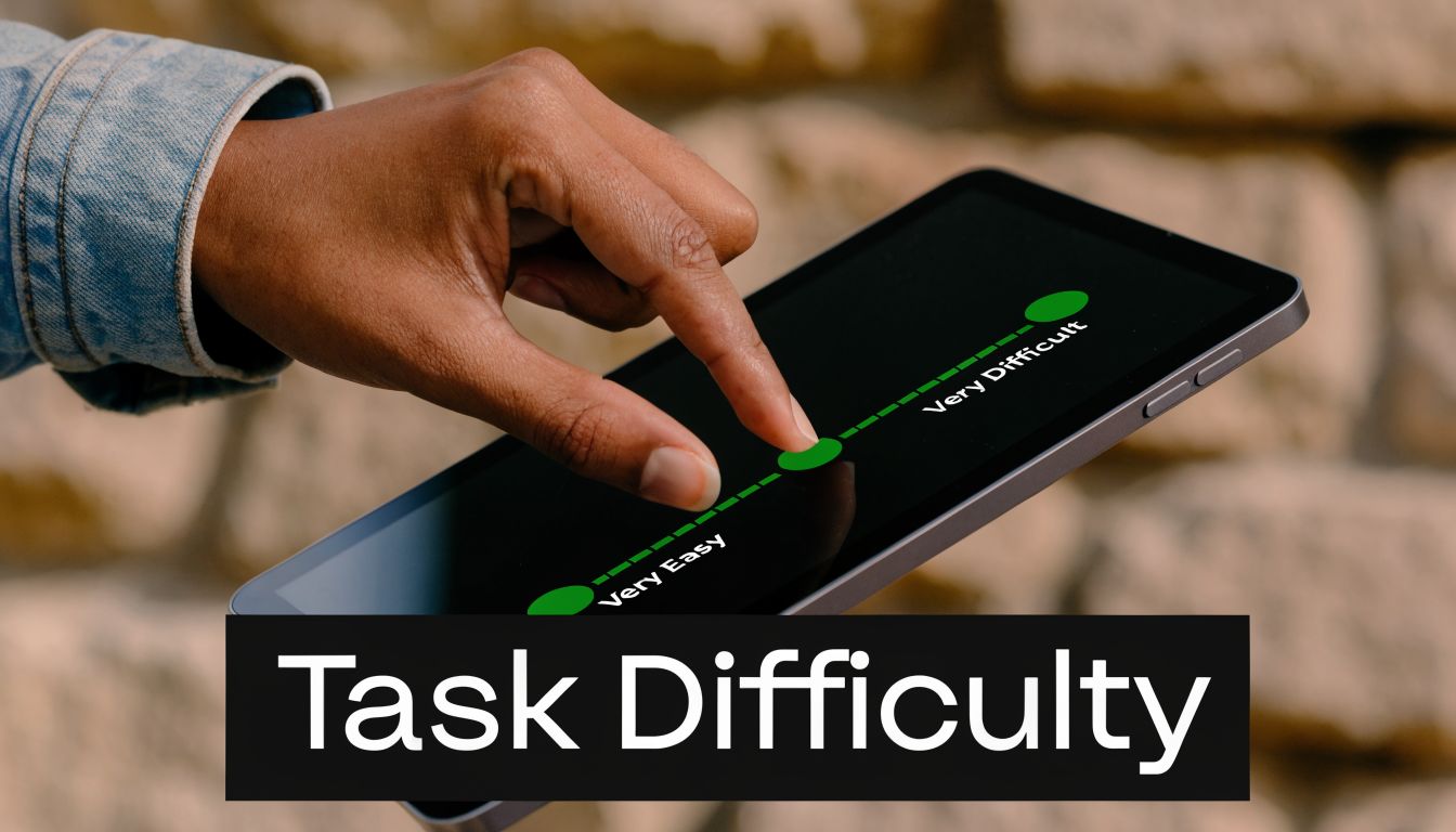
5. Single Ease Question SEQ and Subjective Mental Effort Rating
A founder watches five people test the same Bubble MVP. All five finish the task. On paper, that can look like a pass. Then you ask one question right after the task, and the pattern changes. Three users say it was harder than they expected, and two describe it as mentally tiring even though they got through it.
That is where SEQ earns its place.
The Single Ease Question is simple: “Overall, how easy or difficult was this task to complete?” Ask it immediately after a task, on a 7-point scale from very difficult to very easy. For MVP testing, I use it to find the workflows that technically work but still create friction. That distinction matters on Bubble because a workflow can be functionally correct and still feel confusing, slow, or fragile to a first-time user.
Where to use it
Use SEQ after tasks tied to your product’s core value proposition, not after every tiny click.
Good candidates include:
Account setup: Finishing onboarding and reaching the first useful screen
Core action: Creating a record, sending a request, booking, paying, or publishing
Integration flow: Connecting Stripe, Zapier, Google Sheets, or Twilio
Mobile behavior: Completing a key action on a smaller screen
Timing matters here. Ask too late and users summarize the whole session. Ask right away and you capture the task they just experienced, while the friction is still specific.
I usually pair the score with one follow-up question: “What made that feel easy or difficult?” That gives you the diagnosis. The number helps you spot the problem area. The explanation tells you what to fix.
SEQ versus mental effort
SEQ measures perceived ease. Mental effort measures how much concentration the task required. Those are related, but they are not interchangeable.
This shows up often in no-code products. A user may complete a settings flow, but only by holding too much in working memory. They compare labels across screens, check whether data saved, and try to infer system status from weak feedback states. The task is complete. The experience is still tiring.
That is why a lightweight effort check can help. You do not need a formal survey battery in an early-stage test. A simple prompt works: “How mentally demanding did that feel?” Then ask why if the answer sounds high.
If users finish a task but have to think too hard the whole way through, the workflow still needs work.
How I use this in Bubble MVP tests
For founders, the essential value is prioritization.
If onboarding gets decent ease ratings but your Stripe connection flow gets consistently low scores and high effort comments, that is the bottleneck. If users can publish a listing easily on desktop but struggle on mobile because the save button drops below the fold, that is a clear fix. If they complete a form builder setup but describe the logic step as mentally heavy, you probably need better defaults, clearer labels, or stronger confirmation states.
SEQ works best when you compare tasks against each other inside the same test. That makes it easier to decide what to fix before the next sprint, especially when time and budget are tight. SUS gives you the broader read on overall usability. SEQ and mental effort tell you which part of the MVP is draining trust, attention, or momentum.
6. Net Promoter Score Question Plus Follow-Up Drivers
NPS is popular because it’s simple. That’s also why founders misuse it.
The classic question asks how likely someone is to recommend the product to a friend or colleague. It’s not a usability question in the narrow sense. It’s a loyalty and advocacy question. That means it belongs later in the conversation, after users have completed the workflow that matters.
When it’s worth asking
For a Bubble MVP, NPS can help once the user has experienced the core value proposition. If your product helps service businesses get paid faster, don’t ask NPS at sign-up. Ask after they’ve sent or completed a payment flow. If your product automates follow-up, ask after they’ve seen that automation work.
That timing keeps the question grounded in use, not branding.
The follow-up is where valuable insight lives: ask for the primary reason for the score. Singular, not broad. You want the main driver, not a list of everything they’ve ever thought about the product.
What founders can learn from it
The value of NPS in early-stage products isn’t the number by itself. It’s the pattern in the reasons.
You might find that strong scores cluster around speed to first value, while weaker scores cluster around setup friction. You might learn that people love the promise but don’t trust the system yet. Or that the interface is fine, but the workflow still feels risky because there isn’t enough confirmation feedback.
That’s useful because usability issues often suppress recommendation intent before they suppress explicit satisfaction. A founder may hear “pretty good” in a session, then get a weak recommendation score because the user wouldn’t confidently tell someone else to rely on it.
What not to do with NPS
Don’t treat NPS as proof of product-market fit for an MVP after a handful of friendly tests. And don’t use it as your primary usability measure. It’s too broad for that.
It works best as a directional layer on top of behavioral testing, not instead of it.
A good founder workflow looks more like this:
First: Observe task completion.
Second: Ask task-level ease questions.
Third: Debrief major friction points.
Then: Ask whether they’d recommend it, and why.
That sequence keeps the signal clean. If someone gives a weak score, you’ll already have context from the test. If someone gives a strong score despite visible struggle, that’s worth investigating too. It may mean the product solves a painful enough problem that users are willing to tolerate friction, for now.
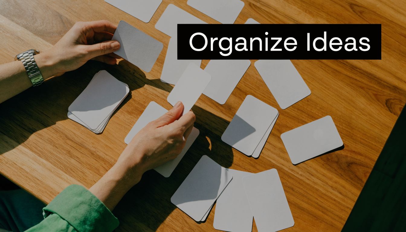
7. Card Sorting Open Closed Hybrid
A Bubble founder ships an MVP fast, gets a few test sessions in, and hears the same kind of comment three times in a row: “I’m not sure where I’d find that.” The feature exists. The label is wrong, or the grouping is.
That is where card sorting earns its place.
If users cannot predict where settings, reports, messages, or billing live, task-based testing starts with an avoidable handicap. Card sorting helps you examine the structure underneath the screen. For no-code products, that matters because founders often organize the app around how they built it in Bubble, not how customers expect to use it.
Which type to use
The method changes depending on what you need to learn.
Open sort: Users create their own categories.
Closed sort: Users place items into categories you defined.
Hybrid sort: Users use your categories and can add new ones if yours do not fit.
Open sorting works best early, especially when you suspect your product language came from the builder, not the customer. Closed sorting is better once you already have a draft navigation or settings structure and want to see whether people can place items where you expect. Hybrid sorting is my usual choice for MVP refinement because it tests your proposed structure without forcing users into bad labels.
That trade-off matters. Open sorts give richer language, but they are messier to analyze. Closed sorts are faster to review, but they can hide confusion if participants force items into the least-wrong bucket.
Prompts that produce useful data
Keep the prompts plain. The quality comes from the item set and the follow-up, not clever wording.
Grouping prompt: “Group these items in a way that makes sense to you.”
Labeling prompt: “What would you name each group?”
Reasoning prompt: “What made these items belong together?”
Conflict prompt: “Which items were hardest to place?”
Expectation prompt: “If you wanted to find this in a product, where would you look first?”
For Bubble founders, I would test real labels from the app, not sanitized workshop terms. If your product uses labels like workflows, conditions, data types, privacy rules, or endpoints, and your users are small business owners or operations staff, you need to know whether those terms clarify anything or just expose your build process.
Card sorting also needs a different sample mindset than a small moderated usability round. Use it when your information architecture is the question you need answered, not as a default exercise on every MVP.
Where it pays off in no-code products
The best use cases are usually structural problems that keep showing up across tasks.
A founder portal where users mix up personal account settings and company settings.
A two-sided marketplace where booking, chat, invoices, and payouts feel scattered across the app.
A client dashboard where reports, automations, and billing sit under labels that make sense to the maker but not the buyer.
I have found this especially useful after hearing vague complaints like “it feels cluttered” or “I don’t know where things go.” Those comments often sound visual, but the underlying issue is categorization. Users are spending effort deciding where to look before they can even judge whether the workflow itself is any good.
Card sorting will not tell you if a checkout flow has too many steps or whether a form asks for the wrong fields. It will show you whether people can form a reliable mental map of the product. For an MVP on Bubble, that can be the difference between “I can probably use this” and “I’ll come back later,” which usually means they will not come back.
8. Unmoderated Remote Testing Questions Self-Guided Prompts
Moderated testing gives you richer context. Unmoderated testing gives you scale and more natural conditions. For many Bubble founders, both matter.
Unmoderated tests are useful once your main flow is stable enough that users can attempt it without live support. You send clear prompts, users record screen and voice, and you review the sessions later. It’s a strong fit for validating whether your interface still makes sense when nobody is there to rescue the user.
Why prompt quality matters more here
In unmoderated tests, your script is the moderator. If the task wording is vague, your data will be vague too.
Good self-guided prompts tell users exactly what they’re trying to accomplish and how they’ll know they’ve completed it. They should sound like real tasks, not survey instructions.
Examples:
Client workflow: “Create a new customer record and send the first follow-up.”
Payments workflow: “Complete a test payment and stop when you reach the confirmation screen.”
Mobile workflow: “Using your phone, find your latest report and explain whether the layout makes sense.”
The quality bar is high because you won’t be there to clarify terms. If your audience is non-technical founders, avoid internal Bubble language unless they’d encounter it directly in the product.
What to ask after each task
Keep the follow-up light and consistent:
Ease probe: “What felt easy?”
Friction probe: “What was confusing?”
Expectation probe: “What did you expect to happen?”
Confidence probe: “How sure are you that you completed the task correctly?”
This format works because it captures both performance and interpretation without overloading the participant.
One caution here: unmoderated testing is not the right place to start if your interface is still rough and your task wording hasn’t been validated. In founder-led research, I usually run a few moderated sessions first to make sure the tasks are understandable. Then I scale out.
The trade-off you should accept
You’ll lose the ability to probe in the moment. That’s the price. But you gain a look at how the product behaves in a more realistic setting, on the user’s device, in their environment, with their patience level.
For no-code MVPs, that’s valuable because real-world conditions often expose issues that founder-led Zoom sessions smooth over. A mobile layout that seemed acceptable on your laptop may break trust instantly on someone else’s phone. A multistep flow may feel fine when you’re watching, but drag when they’re alone.
Use unmoderated tests when the question is no longer “Where are people getting confused in general?” and becomes “Does this flow hold up consistently without us in the room?”
8-Method Comparison of Usability Testing Questions
Method | 🔄 Implementation Complexity | ⚡ Resources / Speed | 📊 Expected Outcomes | ⭐ Effectiveness / Quality | 💡 Quick Tip |
|---|---|---|---|---|---|
System Usability Scale (SUS) Questions | Low, standardized 10 items, easy to deploy | Very low time per user (2–3 min); small samples OK | Single benchmarkable usability score (0–100) for comparisons | ⭐⭐⭐⭐, strong for trend/benchmarking, limited depth | Administer after realistic tasks and pair with open follow-ups |
Task-Based Scenario Questions | Medium, requires careful scenario design and success criteria | Moderate time to run & analyze; per-task timing required | Concrete completion rates, time-on-task, error rates | ⭐⭐⭐⭐⭐, high diagnostic value for workflow issues | Write 5–7 clear scenarios with measurable success criteria |
Attitudinal vs. Behavioral (Think-Aloud) | Medium–High, needs skilled moderator and recording setup | Slower sessions; transcription/analysis intensive | Rich qualitative insights tying behavior to thoughts | ⭐⭐⭐⭐, excellent for "why" behind behaviors, can affect timing | Warm up participants; minimize moderator interruptions |
Critical Incident Technique (CIT) Questions | Medium, interview skill required, retrospective format | Time-intensive interviews but fewer sessions needed | High-impact anecdotal incidents and workarounds for roadmap | ⭐⭐⭐⭐, reveals high-value pain points and wins | Ask open incident prompts and capture verbatim quotes |
Single Ease Question (SEQ) & SMEQ | Low, single-question post-task metrics | Very fast; can be asked after every task with minimal fatigue | Per-task perceived difficulty and cognitive load (granular) | ⭐⭐⭐, great for spotting hard tasks, limited context | Ask immediately after task and follow with one open why-question |
Net Promoter Score (NPS) + Follow-Up | Low, single numeric question + open driver probe | Very quick to collect; easy to benchmark | Net promoter metric and qualitative drivers of loyalty | ⭐⭐⭐, useful high-level sentiment indicator, low specificity | Ask after core workflow and code follow-ups into themes |
Card Sorting (Open/Closed/Hybrid) | Medium–High, setup + analysis (similarity matrices) | 15–30 min per user; larger samples (15–30+) preferred | Mental model maps and IA groupings to inform navigation | ⭐⭐⭐⭐, strong for IA and terminology alignment | Use real product labels and analyze agreement % for IA decisions |
Unmoderated Remote Testing (Self-Guided) | Low, create crystal-clear scripted prompts | High scale; cost-efficient per participant, asynchronous | Large video library of natural task performance at scale | ⭐⭐⭐, excellent for scale and ecological validity, less probing | Pilot first 5 videos to validate prompt clarity and adjust wording |
Stop Guessing, Start Testing Your Next Steps
A founder ships a Bubble MVP, watches two signups stall halfway through onboarding, and starts debating whether the problem is copy, layout, or the workflow itself. That debate usually lasts longer than the test setup.
The faster path is narrower. Test the one workflow that proves your MVP has value. In Bubble, that is usually the first complete job users hire the product to do: book a slot, send a message, pay an invoice, submit a request, or set up the first automation. If that path breaks, the rest of the product does not matter yet.
For an early round, keep the scope tight. Write 3 to 5 realistic tasks around that core path, recruit a small set of target users, and run moderated sessions. As noted earlier, a lean sample is often enough to surface the repeated problems that deserve immediate fixes. The goal is not statistical certainty. The goal is to catch the failures that block learning and revenue.
If time is short, start with two methods: task-based scenarios and think-aloud prompts. That pairing gives founders the best signal per hour. You see whether people can finish the workflow, and you hear where their mental model diverges from what the interface is asking them to do.
Set your success criteria before the first session. Define what completion looks like, what counts as failure, and which moments qualify as meaningful friction. Earlier in the article, I referenced benchmark guidance for this discipline. It matters even more in no-code products because founders are often judging flows they built themselves. Clear criteria reduce self-serving interpretation.
After each session, sort issues into three buckets:
Blockers: The user cannot complete the task or completes the wrong action.
Heavy friction: The user finishes, but hesitates, backtracks, asks for reassurance, or shows low confidence.
Polish issues: The experience is rough, but the user still gets the job done without serious risk.
Then prioritize by damage to the value proposition. Fix blockers first. Fix heavy friction next if it affects activation, conversion, or support load. Leave polish for later unless it creates trust issues in a sensitive step such as payments or personal data entry.
Bubble adds a practical twist here. A confusing moment is not always a surface-level UX issue. I have seen testers blame labels when the underlying problem was a hidden conditional, a delayed database write, a broken privacy rule, or a workflow that changed button states at the wrong time. In no-code MVPs, usability problems often sit at the boundary between interface, logic, and data structure. Treat session notes as clues, not diagnoses.
That is why the review step matters as much as the interviews. Pull the recordings, mark the exact failure points, and ask a simple question for each one: is this caused by wording, hierarchy, interaction design, workflow logic, or system feedback? Founders who do that consistently make better sprint decisions and waste less time rebuilding the wrong layer.
Outside help can speed this up if the team is stuck. If your Bubble app has issues tied to responsive layouts, Stripe flows, API Connector behavior, or custom workflow logic, a second set of experienced eyes can turn messy observations into a practical fix list.
If you want help designing a Bubble usability test, interpreting what your sessions mean, or turning feedback into clear product fixes, Codeless Coach is a strong next step. Matt Blake works one-to-one with founders and teams building on Bubble, with practical support across MVP scoping, UX decisions, responsive layouts, API Connector setups, Stripe and Twilio integrations, and launch prep. It’s a good fit if you need hands-on guidance, not generic advice.