Apr 20, 2026

Master CSS Animation Backgrounds for Your Bubble App

Css animation background - Create stunning CSS animation background effects for your Bubble.io app. Our guide covers gradients, parallax, performance tips, &

Your Bubble app works. The workflows fire, the database is structured, and users can get from login to result without friction. Then you open the landing page or dashboard and it still feels unfinished.

That usually isn’t a product problem. It’s a presentation problem. A flat page makes a solid MVP look cheaper than it is, especially when competitors use small motion cues to make their interface feel more polished.

A well-built css animation background fixes that fast. Not with a heavy Bubble plugin, and not with a pile of JavaScript you’ll have to debug later. Just CSS inside an HTML element, applied carefully so the page feels alive without turning mobile performance into a mess.

Beyond Static Pages Elevate Your App with CSS Backgrounds

A lot of founders hit the same point. The app is functional enough to demo, maybe even ready for early users, but the first screen still looks like a wireframe. Buttons work. Inputs work. The value is there. The experience doesn’t quite signal it yet.

That’s where background animation earns its keep. Subtle motion behind a hero section, onboarding screen, or callout area can make the interface feel deliberate instead of default. It adds perceived quality without changing your product logic at all.

A digital tablet interface display for an elevator control system showing floor status and destination controls.

CSS animations became a real turning point for modern design when the W3C introduced CSS Animations Module Level 1 in 2012. On mobile devices, they delivered up to a 60% performance improvement over JavaScript alternatives in benchmarks, and they can hold a smooth 60fps, which matters when 65% of web traffic is mobile in major markets, as documented in MDN’s guide to CSS and JavaScript animation performance.

Why Bubble builders should care

Bubble already gives you a fast path to shipping. The problem starts when founders try to make a page feel premium by stacking plugins, loading oversized videos, or injecting visual effects they can’t tune later. That’s where performance debt shows up.

A lightweight css animation background is often the better move because it stays close to the browser. You can drop it into a Bubble HTML element, control it with CSS, and keep the effect isolated to one section instead of bloating the entire page.

If you’re also refining layout, spacing, and visual hierarchy, it helps to pair motion with stronger UI fundamentals. This guide on web app design is useful if your app doesn’t just need animation, but a sharper visual system overall.

Practical rule: If the app already solves a real problem, motion should support that credibility, not compete with it.

What works best in practice

For Bubble apps, the best background animations usually share three traits:

  • They’re slow enough to fade into the background. Users notice polish, not the mechanic.

  • They stay behind content. Good background motion frames headlines, forms, and dashboards instead of stealing focus.

  • They’re easy to remove or tone down. If a section feels busy, you should be able to change one duration value or disable the effect entirely.

That’s the mindset throughout this article. Use CSS for polish. Keep the implementation simple. Make choices you can still maintain a month from now.

Technique 1 Crafting Smooth Animated Gradients

Animated gradients are the easiest place to start because they look modern, don’t require image files, and fit almost any SaaS or marketplace layout. They work especially well behind hero text, login cards, pricing banners, and empty dashboard states.

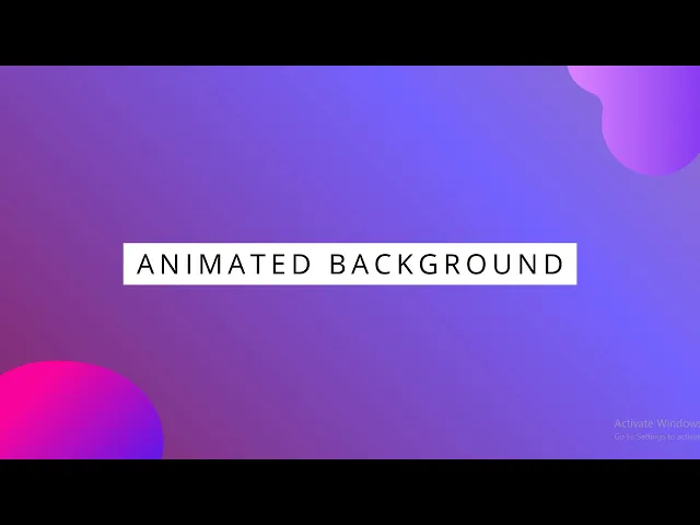
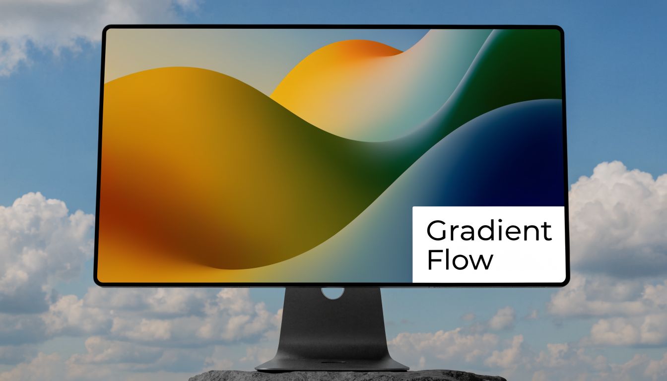
Start with this visual reference.

A modern computer monitor displaying a colorful, abstract gradient wave animation against a blue sky background.

Copy and paste this into a Bubble HTML element

<style>
.gradient-bg-wrap {
  position: relative;
  overflow: hidden;
  border-radius: 16px;
  min-height: 320px;
  background: linear-gradient(-45deg, #0f172a, #2563eb, #06b6d4, #7c3aed);
  background-size: 400% 400%;
  animation: gradientShift 18s ease infinite;
}

.gradient-bg-content {
  position: relative;
  z-index: 2;
  padding: 48px 32px;
  color: white;
}

@keyframes gradientShift {
  0% {
    background-position: 0% 50%;
  }
  50% {
    background-position: 100% 50%;
  }
  100% {
    background-position: 0% 50%;
  }
}
</style>

<div class="gradient-bg-wrap">
  <div class="gradient-bg-content">
    <h2>Your headline here</h2>
    <p>Your Bubble content can sit on top of the animated background.</p>
  </div>
</div>

If you want Bubble-native elements on top instead of HTML text, use the HTML element for the background layer only and place a Group above it. Set the Group to align with the same width and height, then use Bubble’s layout controls to stack content over the animated block.

What each part is doing

The CSS looks more technical than it really is. A few lines do most of the work.

  • linear-gradient(...) creates the color blend.

  • background-size: 400% 400% gives the gradient a larger canvas so it has room to move.

  • @keyframes gradientShift defines the movement path.

  • animation: gradientShift 18s ease infinite; tells the browser which animation to run, how long it should take, and that it should loop forever.

The reason this effect feels smooth is that the browser is moving the background through a defined sequence instead of redrawing random visual states.

Slow gradients usually look better than fast gradients. If users can track the movement easily, it’s probably too aggressive for a background.

How to place it in Bubble

Use this process when you want a reliable result:

  1. Drop in an HTML element on the page or inside a Group.

  2. Paste the full snippet into that element.

  3. Set a fixed or minimum height on the containing Group so the animation has room to show.

  4. Overlay Bubble content using a Group above the HTML element, or keep the text inside the snippet if the section is simple.

  5. Test on mobile width before publishing. Gradients that look elegant on desktop can feel heavy if the section becomes too tall on a phone.

A quick demo helps if you want to compare syntax with another implementation style.

Small edits that make a big difference

You don’t need to rewrite the whole block to customize it.

Setting

What to change

Effect

Speed

18s to 30s

Slower, calmer movement

Energy

ease to linear

More constant motion

Color mood

gradient color values

Changes the brand feel

Section shape

border-radius

Makes it card-like or full-width

For most Bubble MVPs, I’d start with a slower duration and fewer colors. A founder usually wants “premium,” but often pastes in something closer to “crypto landing page from last year.” Keep it restrained.

Technique 2 Using Background Position for Subtle Motion

If gradients feel too decorative, animate background-position instead. This is better when you want texture rather than color movement. Think soft clouds, a faint grid, dots, waves, or a repeating SVG pattern drifting behind a signup form.

This technique is closer to ambient motion. It doesn’t shout for attention.

A simple scrolling pattern snippet

<style>
.pattern-bg {
  position: relative;
  min-height: 280px;
  overflow: hidden;
  background-image: url("data:image/svg+xml,%3Csvg xmlns='http://www.w3.org/2000/svg' width='120' height='120' viewBox='0 0 120 120'%3E%3Ccircle cx='20' cy='20' r='2' fill='%23ffffff' fill-opacity='0.18'/%3E%3Ccircle cx='80' cy='60' r='2' fill='%23ffffff' fill-opacity='0.18'/%3E%3Ccircle cx='40' cy='100' r='2' fill='%23ffffff' fill-opacity='0.18'/%3E%3C/svg%3E");
  background-repeat: repeat;
  background-color: #111827;
  animation: driftBg 40s linear infinite;
}

.pattern-content {
  position: relative;
  z-index: 2;
  color: white;
  padding: 40px 32px;
}

@keyframes driftBg {
  from {
    background-position: 0 0;
  }
  to {
    background-position: 240px 120px;
  }
}
</style>

<div class="pattern-bg">
  <div class="pattern-content">
    <h2>Subtle motion, cleaner feel</h2>
    <p>This works well behind forms, pricing blocks, and feature callouts.</p>
  </div>
</div>

The main difference from the gradient version is that you’re moving an image pattern across the element, not shifting colors inside the same painted area.

When this method is the better choice

Use animated background-position when the page already has enough color. Dashboards, client portals, and B2B apps often benefit from a restrained texture more than a bright gradient.

It also helps when you want to create movement that feels directional. A slight horizontal drift can make a hero section feel active without making the whole page look flashy.

Here’s a useful way to decide:

  • Choose gradients when your page needs visual warmth or a premium brand layer.

  • Choose pattern drift when your page already has strong UI elements and just needs motion in the background.

  • Choose static backgrounds when the section contains dense data, tables, or multiple competing actions.

Bubble setup that avoids layout headaches

The cleanest Bubble implementation is usually:

  • Add an HTML element inside a Group.

  • Make the HTML element stretch to the full size of that Group.

  • Keep the pattern snippet in the HTML element.

  • Place text, buttons, or forms in a separate Group above it.

  • If the effect should sit behind an entire page section, put both Groups inside a parent container and use Bubble’s responsive settings to keep them aligned.

If your background pattern feels noticeable after five seconds, it’s probably too fast.

Easy ways to adjust the feel

This animation responds well to small changes:

  • Increase the duration if it feels distracting.

  • Reduce the pattern contrast by lowering opacity in the SVG fill.

  • Change the end background-position values to control the direction of travel.

  • Replace the embedded SVG with your own tileable SVG or PNG if you want branded shapes.

This is one of the safest css animation background styles for founders because it adds life without forcing a visual redesign. It slips into an existing Bubble page more easily than almost any other motion effect.

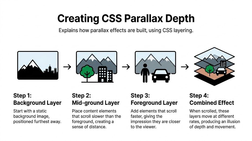
Technique 3 Building Depth with Layered Parallax Effects

Parallax is where founders usually get ambitious. It can look excellent when done with restraint. It can also make a page feel cluttered fast.

The useful version for Bubble isn’t the huge storytelling scroll experience you see on agency sites. It’s a compact layered background that creates depth inside a hero, promo section, or feature block.

An infographic illustrating the four-step process for creating a parallax scrolling effect using CSS layers.

A layered CSS setup that works in one element

<style>
.parallax-bg {
  position: relative;
  min-height: 360px;
  overflow: hidden;
  border-radius: 20px;
  background-color: #0b1120;
}

.parallax-layer {
  position: absolute;
  inset: 0;
  background-repeat: repeat-x;
  background-position: 0 bottom;
  will-change: transform;
}

.layer-back {
  background-image: url("https://images.unsplash.com/photo-removed-for-example");
  opacity: 0.18;
  animation: moveBack 60s linear infinite;
  background-size: cover;
}

.layer-mid {
  background-image: radial-gradient(circle at 20% 30%, rgba(255,255,255,0.10) 0, rgba(255,255,255,0) 35%),
                    radial-gradient(circle at 80% 20%, rgba(255,255,255,0.08) 0, rgba(255,255,255,0) 30%);
  animation: moveMid 35s linear infinite;
}

.layer-front {
  background-image: linear-gradient(90deg, rgba(255,255,255,0.04) 1px, transparent 1px);
  background-size: 80px 100%;
  animation: moveFront 18s linear infinite;
}

.parallax-content {
  position: relative;
  z-index: 5;
  color: white;
  padding: 56px 32px;
}

@keyframes moveBack {
  from { transform: translateX(0); }
  to { transform: translateX(-40px); }
}

@keyframes moveMid {
  from { transform: translateX(0); }
  to { transform: translateX(-90px); }
}

@keyframes moveFront {
  from { transform: translateX(0); }
  to { transform: translateX(-140px); }
}
</style>

<div class="parallax-bg">
  <div class="parallax-layer layer-back"></div>
  <div class="parallax-layer layer-mid"></div>
  <div class="parallax-layer layer-front"></div>
  <div class="parallax-content">
    <h2>Layered depth for premium sections</h2>
    <p>Use this behind a headline or launch block, not behind dense app UI.</p>
  </div>
</div>

One note before you paste this. Replace the placeholder image URL in .layer-back with your own asset. A lightweight texture, skyline, or soft illustration works better than a detailed photo.

Why the effect feels deeper

Parallax works because each layer moves at a different speed. The rear layer moves slowly, the middle layer moves more, and the front layer moves the most. Your eye reads that as distance.

In this version, each layer is absolutely positioned and animated with a different duration. The content sits above all three layers with a higher z-index.

Where to use it in Bubble

This effect belongs in selective spots. Good choices include:

  • A homepage hero for a strong first impression

  • A feature section between static content blocks

  • A launch page banner where you want some visual depth

Bad choices include dashboards, admin panels, data-heavy screens, and forms users need to complete quickly.

Use parallax where you want atmosphere. Don’t use it where users need concentration.

If you’re already layering visual treatments in Bubble, details like borders and inner framing matter too. This walkthrough on CSS inner border styling pairs well with parallax sections because it helps foreground cards stand out cleanly against more active backgrounds.

A safer way to manage complexity

Parallax can spiral if you keep adding layers. In practice, three layers is enough for most Bubble builds.

A simple decision framework helps:

Layer

Job

Best content

Back

Sets mood

soft texture or large shape

Mid

Adds visible movement

glow, cloud, or gradient haze

Front

Creates depth cue

lines, dots, geometric pattern

If the section already has a headline, paragraph, buttons, and an image mockup, don’t pile on more animated layers. The strongest effect usually comes from less code, not more.

Optimizing for Performance and Accessibility

A background animation that feels polished on your desktop can make a Bubble app feel cheap on a real phone. I see this a lot with founders who copy a nice CSS demo into an HTML element, publish the page, and only notice the problem once scrolling starts to stutter.

The issue is usually the property being animated.

Browsers handle some animations far better than others. transform and opacity are usually the safest choices because they often avoid layout recalculation and heavy repaint work. Google’s guidance on high-performance CSS animations recommends sticking to those properties for smoother rendering.

Properties like background-color, large box-shadow changes, and filter: blur() are different. They can force the browser to repaint large areas of the screen on every frame. In a simple HTML demo, that may be acceptable. Inside Bubble, where the same page may also contain responsive groups, conditionals, repeating groups, and floating elements, the cost shows up faster.

What this means inside Bubble

Bubble builders need a stricter standard than a generic CSS tutorial gives you. The browser is already doing work to render Bubble’s layout system. Your animation has to fit around that, not compete with it.

Use these rules before you ship:

  • Animate one wrapper, not a whole screen of elements. A single animated background container behind content is easier for the browser to handle than ten separate animated cards.

  • Be careful with blur. A soft blur can work for a hero section. Multiple blurred layers usually hurt mobile performance.

  • Slow the motion down. A 20 to 30 second loop often looks more premium than a fast 6 second loop, and it draws less attention away from the product.

  • Keep the animated area contained. Full-screen effects cost more than a fixed section with overflow: hidden.

  • Test the live page. Bubble preview is useful for setup, not for judging final animation quality.

If you plan to mix CSS effects with custom scripts, this guide on Bubble custom JavaScript help covers the next layer of implementation without turning your no-code build into a maintenance problem.

A good rule is simple. The background should support the page, not become the heaviest thing on it.

Add reduced motion support

Performance is only half the job. Motion also affects accessibility.

Animated backgrounds can distract users, reduce readability, or create discomfort for people who are sensitive to movement. Bubble does not handle that for you automatically when you paste CSS into an HTML element, so the fallback needs to be part of your snippet.

Keep this under your animation styles:

@media (prefers-reduced-motion: reduce) {
  .gradient-bg-wrap,
  .pattern-bg,
  .parallax-layer {
    animation: none !important;
    transform: none !important;
  }
}
@media (prefers-reduced-motion: reduce) {
  .gradient-bg-wrap,
  .pattern-bg,
  .parallax-layer {
    animation: none !important;
    transform: none !important;
  }
}
@media (prefers-reduced-motion: reduce) {
  .gradient-bg-wrap,
  .pattern-bg,
  .parallax-layer {
    animation: none !important;
    transform: none !important;
  }
}

That media query respects the user’s system setting and turns the motion off. The section still displays. It just stops moving.

That is the standard to aim for in Bubble. The effect should remain attractive and readable even when animation is disabled. For a broader review before publishing, use these accessibility guidelines for websites.

A practical Bubble testing pass

Before you keep any CSS background animation in production, run through this checklist:

  1. Scroll the page on a real phone. If the motion feels uneven, reduce layers or remove blur first.

  2. Watch text over a full animation loop. Headlines and buttons need to stay readable at every point, not just in the nicest frame.

  3. Check load and interaction together. Open dropdowns, tap buttons, and scroll while the effect runs.

  4. Turn on reduced motion in your device settings. Reload the page and confirm the animation fully stops.

  5. Remove the effect from task-focused screens. Dashboards, checkout flows, forms, and admin views usually perform better without background motion.

Founders do not need more animation. They need the right amount, in the right place, with code that still behaves well inside Bubble.

Bringing It All Together in Your No-Code App

The practical path is simple. Use an animated gradient when a page needs energy, use background-position drift when a section needs texture, and use layered parallax only when you want a controlled sense of depth.

In Bubble, the win isn’t just that these effects look good. It’s that you can drop them into an HTML element, keep ownership of the code, and avoid relying on another plugin for something the browser already handles well.

Start small. Add one css animation background to one section, test it on mobile, and decide whether it improves the page or just decorates it. The best founders do this the same way they handle product features. They keep what helps and cut what gets in the way.

Common Questions about CSS Animations in Bubble

A lot of Bubble founders get the first background animation working, then hit key questions once it goes on a live page. The pattern is predictable. It looks clean on a laptop, feels rough on mobile, or starts fighting Bubble’s responsive engine.

That’s the gap between generic CSS advice and actual Bubble implementation. In Bubble, you are not just writing animation code. You are placing it inside an HTML element, inside a responsive layout system, inside a page that still has to load fast and stay usable.

Why does my animation look fine on desktop but lag on mobile

Mobile lag usually means one of three things. Too many animated layers, oversized background assets, or animation properties that force the browser to repaint large parts of the page.

The fix is usually simpler than founders expect. Cut the number of moving pieces first. Then slow the animation down. If the effect still feels heavy, switch from animating background properties to animating transform on a child layer, because that is usually easier for the browser to handle.

Use a lighter pattern like this:

.light-motion-layer {
  will-change: transform;
  animation: floatX 24s linear infinite;
}

@keyframes floatX {
  from { transform: translateX(0); }
  to { transform: translateX(-40px); }
}
.light-motion-layer {
  will-change: transform;
  animation: floatX 24s linear infinite;
}

@keyframes floatX {
  from { transform: translateX(0); }
  to { transform: translateX(-40px); }
}
.light-motion-layer {
  will-change: transform;
  animation: floatX 24s linear infinite;
}

@keyframes floatX {
  from { transform: translateX(0); }
  to { transform: translateX(-40px); }
}

In Bubble, I’d place this on a dedicated HTML element behind the main content, not inside a busy repeating group or dashboard view.

How do I make the background responsive in Bubble

Let Bubble size the container. Let CSS fill it.

That means the parent Group controls width, min height, and breakpoint behavior. The CSS background should follow that container instead of trying to set the layout itself. Hard-coded dimensions usually create trouble once the page hits tablet and mobile breakpoints.

A safe starting pattern is:

.responsive-bg {
  width: 100%;
  min-height: 240px;
  background-size: cover;
  background-position: center;
}
.responsive-bg {
  width: 100%;
  min-height: 240px;
  background-size: cover;
  background-position: center;
}
.responsive-bg {
  width: 100%;
  min-height: 240px;
  background-size: cover;
  background-position: center;
}

If the section crops badly on small screens, change the Group height in Bubble first. Founders often try to solve a layout problem in CSS when the underlying issue is the Bubble container setup.

Can I pause or disable animation for specific users

Yes. This is a smart move for accessibility settings, low-distraction work areas, and older devices.

The simplest option is to define an off state, then apply that class through Bubble conditions, a custom state, or swapped HTML content.

.motion-off {
  animation: none !important;
  transform: none !important;
}
.motion-off {
  animation: none !important;
  transform: none !important;
}
.motion-off {
  animation: none !important;
  transform: none !important;
}

You can also pair that with the browser’s reduced motion preference. Mozilla’s guide on prefers-reduced-motion is the right reference if you want to support users who already asked for less motion at the device level.

FAQ Quick Answers

Question

Short Answer

Why is my animated background choppy?

You are probably animating paint-heavy properties, using image files that are too large, or stacking too many moving layers.

Where should I use background animation in Bubble?

Landing sections, hero areas, signup pages, and simple marketing surfaces where motion supports the message.

What’s the easiest safe effect to start with?

A slow animated gradient or a subtle drifting layer inside one HTML element.

If you want help applying these techniques to a real Bubble app, Codeless Coach gives you direct, practical support from Matt Blake. That includes debugging HTML element placement, improving responsive layouts, and making custom CSS feel polished instead of risky.

Let's chat!

Meet on Zoom

Ready to finally get unstuck?

You don't have to keep going in circles or burning evenings for zero progress.

Book a session, share your screen, and let's solve the thing that's blocking your launch.

Most problems solved in under 60 minutes. Seriously.

Hundreds of Bubble builders trust me to help them get unstuck and launch.

Matt helped me solve a problem I've been stuck on for weeks in less than an hour. His help has been pivotal in the development of my app.

Christina L

Founder of Aurora Helps

When I say this saved me thousands of dollars, I'm not kidding! Do yourself a favour — book some coaching!

RS

Startup Founder

Got questions.
I've got answers.

What if I'm a complete beginner at Bubble?

That's completely fine. Many of my sessions are with builders in their first few months. I'll meet you where you are and explain everything in plain English, no jargon, no judgement. As Luke put it: "I'd highly recommend a coaching call if you're facing Bubble noob issues."

What is Bubble.io coaching?

After watching hundreds of YouTube videos and completing one too many bootcamps, you're still no closer to launching. Sound familiar? One-to-one coaching over Zoom fills that gap. You share your screen, show me exactly where you're stuck, and I help you solve it in real time, on YOUR app, not a generic demo.

How do I prepare for a session?

When booking, you'll answer one question: "What would you like to have learned or fixed by the end of this call?" For example:

  • How do I display data from my database in a repeating group?

  • Is it possible to build [my feature] with Bubble?

  • Why isn't my workflow triggering correctly?

That's all I need. No homework, no prep. Just show up and open your editor.

What can we actually cover in one hour?

More than you'd think. Most builders come in stuck on something they've fought for days or weeks and we solve it in the first 15–20 minutes. That leaves time to tackle your next blocker, review your setup, or talk through your build approach.

As Christina said: "He helped me solve a problem I'd been stuck on for weeks in less than an hour."

Is this worth it if I've already watched tutorials?

Especially then. Tutorials teach general concepts to a general audience. Coaching solves YOUR specific problem on YOUR specific app.

That gap between "I followed the tutorial perfectly" and "it doesn't work on my build" that's exactly what coaching closes.

No tutorial can look at your editor and say "here, this is what's wrong." I can.

Is this different from hiring a Bubble freelancer?

A freelancer builds it for you. I build it with you. After our session, you understand your app better and can handle the next problem yourself. You're building the skill, not a dependency.

How does the Launch Pack email support work?

Between your coaching sessions, you can email me any Bubble question: screenshots, editor links, quick "is this right?" checks.

I'll reply with guidance within 24 hours on business days. It's perfect for quick unblocks and sanity checks that don't need a full call.

Email support is available between sessions for the 60-day validity window of your Launch Pack.

Let's chat!

Meet on Zoom

Ready to finally get unstuck?

You don't have to keep going in circles or burning evenings for zero progress.

Book a session, share your screen, and let's solve the thing that's blocking your launch.

Most problems solved in under 60 minutes. Seriously.