
Mar 20, 2026
Master css border inside: 2026 Guide to Inner Border Effects
Explore the css border inside effect with box-shadow, outline, and pseudo-elements - perfect for no-code founders on Bubble.io in 2026.

Ever tried adding a simple border in CSS, only to watch it expand your element and throw your entire layout into chaos? It’s a classic front-end frustration. The good news is that creating a CSS border inside an element is the secret to predictable, clean designs, and it's much easier than you might think.
The Challenge with Standard CSS Borders
We’ve all been there. You design a perfect 300px wide card, add a simple border: 2px solid black;, and suddenly its total width is 304px. This isn't a bug; it's the default CSS box model, content-box, at work.
With content-box, the width and height properties you set apply only to the content area itself. Any padding or borders you add get tacked onto the outside, which is why your element's final dimensions grow unexpectedly. For anyone trying to maintain a pixel-perfect layout, this can be a real headache, especially for users on no-code platforms like Bubble.io who just want elements to stay where they put them.
The One-Line Fix for Predictable Layouts
Luckily, there’s a simple and powerful fix that solves this problem instantly: box-sizing: border-box;. This one line of CSS completely changes how the browser calculates element size.
It tells the browser to include both the padding and the border within the element's specified width and height. Now, if your card is 300px wide and you add a 2px border, it stays exactly 300px wide. The border is drawn on the inside, preserving your layout.
This property is the foundation for virtually any "CSS border inside" technique. It’s what gives you the stable, predictable sizing you need before trying any fancier tricks.
Think of a founder racing to launch an MVP on Bubble.io, trying to make buttons and cards pop without constantly re-adjusting the layout. The box-sizing: border-box property is a lifesaver. This simple declaration flipped the script on the old days of CSS, where developers spent hours fighting the content-box model. It’s so fundamental now that it’s baked into over 90% of modern frameworks like Tailwind and Bootstrap.
This handy decision tree shows exactly when this rule comes into play.
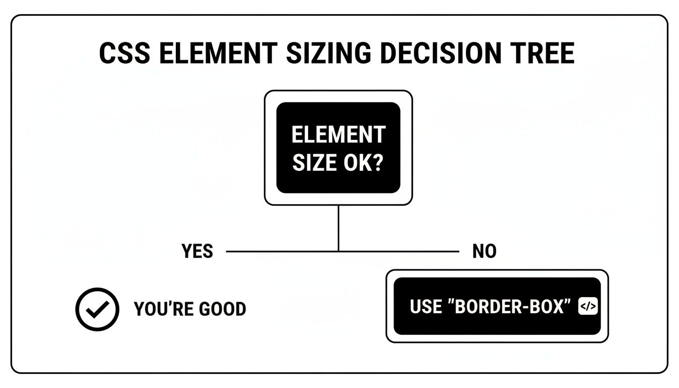
As the flowchart shows, if your element's size is changing in ways you don't expect after adding a border, box-sizing: border-box is almost always the answer. Getting this concept down is a crucial first step. If you're interested in how this fits into the bigger picture of visual design, exploring different front-end technologies and modern UI design can provide valuable context.
Using Inset Box Shadow for Flexible Inner Borders
When it comes to creating a CSS border inside an element, the box-shadow property is my go-to. It’s a surprisingly versatile tool. Most people use it for drop shadows, but a single keyword, inset, completely flips its behavior, drawing the shadow on the inside of an element’s boundary.
The real magic here is that box-shadow doesn't affect the box model. It doesn’t take up any physical space or push other elements around. This means you can add an inner border without worrying about your layout suddenly breaking—a common headache with traditional borders.
Crafting a Crisp Inner Border
Let's start with the most common use case: a clean, sharp inner border. This is perfect for when you want to subtly define an element, like a button or an input field in your Bubble app, without adding extra weight.
The CSS for a crisp, single-pixel line is incredibly simple. The trick is to set the blur and spread values to zero.
.my-button {
box-shadow: inset 0 0 0 1px #CCCCCC;
}
What this code does is draw an inset shadow with no offset, no blur, and a 1px spread in a light gray color. The result is a perfect 1px line that sits just inside the padding edge, looking exactly like a border but without any of the layout side effects.
Adding Soft Inner Glow Effects
This is where box-shadow truly outshines other methods. You can easily create soft, glowing effects, which are fantastic for indicating active or focused states on UI elements like dashboard cards or selected navigation items.
By using an rgba() color for transparency and dialing up the blur radius, you can create a beautiful inner glow.
.dashboard-card-active {
box-shadow: inset 0 0 10px rgba(74, 144, 226, 0.5);
}
This snippet applies a soft, 10px blue glow just inside the card's edge. It's this ability to create nuanced, polished effects that makes box-shadow a favorite for modern UI design.
The
box-shadowproperty is a designer's best friend for adding depth without altering an element's dimensions, which means no frustrating layout shifts. Given that W3Techs reports CSS is used on 97.1% of all websites as of March 2026, mastering these small details is crucial. For our Codeless Coach clients, we often spend a 60-minute session styling elements to perfectly match their Figma mockups, using tricks likeinset 0 0 10px rgba(0,0,0,0.1)to add that final layer of polish.
Even better, you can stack multiple shadows on a single element. Just separate them with a comma. This lets you combine a crisp 1px border with a soft inner glow for more complex and layered designs—something that’s much harder to achieve with other techniques. This is also a great approach for other UI elements; for more ideas on custom styling, you might be interested in our guide on how to add custom CSS for your scrollbar.
Creating Precise Inner Borders with Outline and Outline Offset

While the box-shadow trick is a great all-rounder, there’s another incredibly useful technique in our CSS toolkit for creating inner borders: combining the outline property with a negative outline-offset. It’s a bit of a clever hack. Normally, outline draws a line outside an element’s border, but with a negative offset, we can pull that line right inside the element.
What I love about this approach is its directness. Just like an inset box-shadow, it doesn't mess with the box model, so you won't have to worry about your layouts shifting unexpectedly. The real magic, though, is how it behaves with rounded corners.
For anyone building with a no-code platform like Bubble.io, this is a fantastic way to add quick visual feedback, like highlighting a form input when a user clicks into it.
The Outline Method in Action
Putting this into practice is refreshingly simple. All it takes is two lines of CSS. You set the outline style just like you would a regular border, and then you use outline-offset with a negative value to pull it inwards.
Let’s say you want a clean 2px inner border on a focused input field:
.input-field-focused {
outline: 2px solid #4A90E2;
outline-offset: -2px;
}
This snippet first defines a 2px solid blue outline. Then, the outline-offset pulls it inward by exactly 2px, placing it neatly inside the element’s padding.
Here’s a little tip from experience: always match the negative
outline-offsetvalue to theoutlinewidth. A 3px outline should get a-3pxoffset. This guarantees the border sits perfectly flush against the element’s inner edge every time.
One of the best reasons to reach for this method is how beautifully it handles border-radius. Unlike box-shadow, which can sometimes look a little fuzzy or imperfect on tight curves, an outline follows the curve flawlessly. This makes it my go-to choice for adding inner borders to circles or elements with significant rounding.
Know Its Limits
Before you start using this everywhere, you need to know its main limitation: outline is an all-or-nothing property. It applies the same border to all four sides of the element, period. You can't use it to create an inner border on just the top or bottom, which is where the box-shadow method really has the upper hand.
Here's a quick rundown to help you choose the right tool for the job:
Feature | Outline Method | Box-Shadow Method |
|---|---|---|
Control | All four sides only | Per-side control |
Rounded Corners | Perfect rendering | Generally good, but can be imperfect on sharp curves |
Gradients/Styles | Solid, dotted, or dashed only | Can simulate complex effects |
So, when does this technique really shine? When you need a simple, uniform inner border on all four sides, especially on rounded elements. Imagine you’re styling an active user avatar in your Bubble app—the outline method will give you a crisp, perfectly circular highlight that box-shadow might struggle to render as cleanly.
Advanced Inner Borders with Pseudo Elements
So, what happens when box-shadow and outline just don't cut it? When you need more control over your inner borders, it's time to pull out a real powerhouse technique: CSS pseudo-elements. Using ::before and ::after opens up a world of creative possibilities, letting you build effects that are flat-out impossible with the simpler methods.
At first, this might seem a little complicated, but the idea behind it is surprisingly straightforward. You're basically creating a new, invisible box that sits inside your main element. From there, you can style that new box however you want, making it look and feel like a custom inner border. Think of it like adding a new, fully controllable layer in Figma, but with pure CSS.
Understanding the Pseudo-Element Approach
For this to work, the parent element needs position: relative;. This is the non-negotiable first step, as it establishes a positioning context for the pseudo-element we're about to create.
Next, you target the ::before or ::after pseudo-element and give it position: absolute;. This lets us place it anywhere inside that parent container. By setting its top, bottom, left, and right properties all to zero, it stretches to perfectly match the parent's dimensions.
Once that's in place, we can style it. Adding a standard border to this pseudo-element is what creates the illusion of a css border inside the parent.
The real magic here is that this pseudo-element is a complete, styleable box in its own right. It can have its own borders, backgrounds, gradients, and even a
box-shadow. This unlocks a level of detail the other methods just can't touch.
Creating a Dashed Inner Border
Let's look at a practical example. Imagine you're building a drag-and-drop file uploader in your Bubble.io app. A dashed inner border is a classic design pattern to signal that an area is an active drop zone. Neither outline nor box-shadow can create dashed lines, which makes pseudo-elements the perfect tool for the job.
Here’s how you could get that effect:
.drop-zone {
position: relative;
background-color: #f0f8ff; /* A light blue background */
padding: 2rem;
}
.drop-zone::before {
content: '';
position: absolute;
top: 10px;
left: 10px;
right: 10px;
bottom: 10px;
border: 2px dashed #9bcfed;
border-radius: 5px;
}
In this snippet, we're positioning the ::before element 10px in from every side and then applying a simple dashed border. The result is a crisp, clean inner border that provides fantastic visual feedback for the user. For more inspiration on signaling actions to users, our guide on creating an effective pop-up button has some great tips for boosting your app's interactivity.
When to Use This Advanced Method
This is my go-to method whenever a design calls for something truly custom. It's the best choice when you need total control and flexibility.
It really shines in a few specific scenarios:
Mixed Border Styles: Need a solid border on top but a dotted one on the bottom? Easy.
Gradient Borders: Apply a
border-imageto the pseudo-element for a slick inner gradient border.Multi-Layered Borders: You can use both
::beforeand::afterto create two distinct inner borders for a stacked effect.Precise Spacing: You can dial in the exact spacing between the element's edge and the inner border.
While it does take a little more CSS to set up, the pseudo-element method is the ultimate tool for achieving a polished, high-end look for your MVP. It gives you the power to implement unique designs that make your application feel truly professional and thoughtfully built.
How to Implement These CSS Tricks in Bubble.io
Alright, let's put these CSS techniques into practice. Knowing the theory is great, but applying it inside a no-code platform like Bubble.io is where the magic really happens. This is how you can push past Bubble’s built-in styling options to create a truly polished and custom user interface.
The good news is that it’s more straightforward than you might think. Bubble gives you all the tools you need to inject custom CSS and target any element on your page. The whole process really just comes down to identifying an element and then telling it how to behave with your code.
Assigning an ID Attribute
First things first, your CSS needs a target. You have to tell it exactly which element to style, and in Bubble, we do this using the ID Attribute.
To get this set up, just select the element you want to customize—whether it's a Group, Button, or Shape—and pop open its Property Editor. Scroll all the way to the bottom, and you'll spot an input field labeled "ID Attribute." This is where you'll give your element a unique, descriptive name like main-cta-button or dashboard-card-active.
My advice is to keep your IDs simple, descriptive, and consistent. Avoid spaces and use hyphens instead (e.g.,
user-profile-cardnotUser Profile Card). This makes your CSS much easier to read and manage as your application grows.
Adding Your CSS to the HTML Header
Once your element has an ID, you're ready to write the CSS that targets it. In Bubble, the best spot for page-specific styles is right inside the page’s HTML Header.
You can find this by double-clicking on the page itself (not an element on it) to open its own Property Editor. Look for the "HTML Header and Body" section, and you're in the right place. Any CSS you drop in here will apply to this specific page.
Let's say we want to use the inset box-shadow method we covered earlier to create a CSS border inside an active card. The code would look like this:
See that # before the ID name? That's just CSS syntax for "find the element with this ID." Simply paste your code, wrapped in <style> tags, and you're good to go. If you're looking for a deeper dive into what's possible on the platform, you can learn more about the https://codeless.coach/blog/bubble-app-builder in our detailed guide.
One critical concept to remember when styling in Bubble is box-sizing: border-box. This little CSS rule forces an element's padding and borders to stay inside its defined width and height, preventing them from making the element bigger. This is the key to getting a true inner border effect. It's no surprise this is a common fix, as data from W3Techs shows that as of March 2026, CSS is used on 97.1% of all websites, with an incredible 94.7% using inline styles to embed code just like this.
Organizing for Maintainability
As your app gets more complex, your list of custom CSS snippets will grow right along with it. To prevent a spaghetti-code nightmare, I always recommend using comments in your HTML Header to keep things organized. It's a simple habit that makes finding and editing styles so much easier down the line.
For example, you could structure your code with clear labels:
/* --- Button Styles --- */
/* --- Dashboard Card Styles --- */
/* --- Form Input Styles --- */
Taking a few extra seconds to add these comments will save you hours of frustration later. And for those interested in tackling other advanced design challenges, you might find some great ideas in guides for building dark mode websites in Framer.
Common Questions About CSS Inner Borders
As you get your hands dirty with these techniques, a few questions always seem to surface. Let's walk through some of the common hurdles builders hit when trying to create a CSS border inside an element, so you can troubleshoot with confidence.
What If I Only Need a Border on One Side?
You absolutely can, but your choice of method matters. For this specific job, the box-shadow technique is your best friend. The magic is in the offset values, which let you place the "shadow" (our border) exactly where you want it.
For example, box-shadow: inset 0 5px 0 0 #000; gives you a clean, 5px inner border just on the top of your element. It’s perfect for creating subtle separators. On the other hand, the outline method is an all-or-nothing deal—it always wraps all four sides. Pseudo-elements like ::before also give you that one-sided control, since you can position them anywhere you need.
This kind of per-side control is a design superpower. I often use it to add a simple bottom border to a header or to highlight an active tab. It’s a small touch that
box-shadowmakes incredibly easy.
Which Inner Border Method Is the Best for Performance?
Honestly, for most projects you'll ever build, the performance difference is so small it's not worth worrying about. Modern browsers are incredibly fast and optimized to handle both box-shadow: inset and outline without breaking a sweat.
If you were in an extreme scenario, applying the effect to hundreds of elements all at once, outline is theoretically a hair faster. Its rendering logic is just a bit simpler. The ::before/::after method adds a "virtual" element to the page for each border, which could add a tiny bit of overhead at a massive scale, but this is almost never a real-world problem for apps built on platforms like Bubble.io.
How Do I Make My Inner Border Responsive in Bubble?
Great question. Getting your inner border to look right on every screen size is key. You've got a couple of solid ways to handle this. For simple, fluid adjustments, you can use responsive units like vw (viewport width) instead of fixed pixels (px).
A more powerful and common approach, though, is to use CSS Media Queries. This lets you set specific border styles for different screen sizes, giving you complete control. You might want a bold 5px border on desktop but a more subtle 2px border on mobile to save space.
Desktop Style:
@media (min-width: 992px) { #my-element { box-shadow: inset 0 0 0 5px blue; } }Mobile Style:
@media (max-width: 767px) { #my-element { box-shadow: inset 0 0 0 2px blue; } }
This is how the pros ensure a polished design, and you can easily drop these snippets into the HTML header or a CSS plugin in Bubble to get the same precise control.
Feeling stuck or want to build your Bubble.io app faster? Codeless Coach offers one-on-one, tailored tutoring to help you move past roadblocks and ship your project with confidence. Book a session today!