
Apr 12, 2026
Items Per Page in Bubble: A Complete Pagination Guide
Master items per page in Bubble.io. Learn to implement client-side vs. server-side pagination, load more, infinite scroll, and handle API data.

You’ve probably hit this point already. The app looks good in Bubble, the workflows run, and the core idea works. Then you load a repeating group with customers, products, bookings, or orders, and the page suddenly feels heavy.
Buttons lag. The list jumps around. Mobile gets worse. Sometimes the browser tab just looks like it’s fighting for survival.
That problem usually isn’t Bubble “being slow.” It’s a list strategy problem. More specifically, it’s an items per page problem.
Founders often treat pagination like a cosmetic detail. It isn’t. It’s one of the first structural decisions that separates a scrappy MVP from an app that feels stable, predictable, and scalable. In Bubble, that decision affects your repeating groups, your database searches, your API calls, your mobile experience, and even whether users can find what they need.
A good pagination setup does three jobs at once:
It protects performance by limiting what the page has to load and render.
It improves usability by giving users a list they can scan.
It gives you control over how data grows as the app gets busier.
The right answer isn’t always numbered pages. It also isn’t always infinite scroll. Sometimes the best move is a small server-side page size with a “Load More” button. Sometimes it’s a strict paginated search result. Sometimes it’s a hybrid setup for API-driven data.
What matters is choosing deliberately. If you’re building in Bubble without a traditional engineering team, this is one of the easiest wins available to you.
Why Your Bubble App Feels Slow and How Pagination Fixes It
When a Bubble page feels slow, the repeating group is usually the first thing I inspect.
A lot of builders create a repeating group, point it at Do a search for, and move on. That works for a demo. It breaks down when the list gets real. The page now has to fetch, sort, and render far more records than the user can even process on screen.

Overfetching is usually the primary bottleneck
If your user can only see a handful of rows at once, loading a giant list upfront is wasteful. Bubble still has to evaluate the search, draw the cells, and manage the layout. On mobile, that cost shows up faster.
The common symptoms are easy to spot:
First load drags because the page requests too much data immediately.
Scrolling stutters because the browser keeps repainting large lists.
Filtering feels inconsistent because every change forces a heavy search to refresh.
Responsive layouts wobble because too many elements are recalculating at once.
Pagination fixes this by narrowing the job. Instead of asking Bubble to load everything, you ask it to load only what the user needs right now.
Practical rule: If a user can’t meaningfully review all loaded records in one glance, you’re probably loading too many.
Pagination is a performance tool first
People think of pagination as page numbers at the bottom of a list. In practice, it’s a data loading strategy.
That matters because there are really two separate questions:
How many records should Bubble fetch?
How should the user move through those records?
Those aren’t always the same design decision. You might fetch a small batch server-side and present it with a “Load More” button. You might paginate API data behind the scenes and still give users a simple next/previous control.
Before you build any fancy workflow, get the base repeating group under control:
Set a sensible initial count instead of leaving the list effectively open-ended.
Keep the cell design light so each item is cheap to render.
Avoid nesting expensive searches inside each cell.
Sort predictably so pagination doesn’t feel random when users move between result sets.
The professional move in Bubble isn’t to make the list “work.” It’s to make the list behave well when you have more customers, more products, and more activity than you expected.
The Foundation Your Repeating Group Settings
Before you choose between page numbers, “Load More,” or infinite scroll, the repeating group itself needs to be configured correctly. If the foundation is wrong, every pagination pattern on top of it will feel clumsy.
Start with the repeating group, not the buttons
In Bubble, most pagination trouble starts because the repeating group is trying to do too much.
The key settings to review first are:
Type of content. Set this correctly and keep it specific. Don’t build a generic structure if the list is clearly Products, Orders, or Users.
Data source. Your search logic resides here. Keep it as direct as possible.
Layout style and visible cells. This affects how much Bubble tries to render.
Constraints and sorting. These shape the data before the UI ever sees it.
If you skip this cleanup and jump straight to a plugin, you usually end up hiding a bad search behind prettier controls.
What works and what doesn’t
Here’s the practical split I use with founders.
Approach | What it feels like in Bubble | Trade-off |
|---|---|---|
Load everything into the list | Fast to build, bad as data grows | Heavy page load and poor scaling |
Limit visible records from the start | Better performance and easier control | Requires deliberate workflow logic |
Server-side or API-backed pagination | Best for large or changing datasets | More setup, but much safer long term |
The main mistake is loading a broad search result and assuming the repeating group will sort itself out. It won’t. The page still pays the cost.
A sensible default for most MVPs
For app dashboards and search results, Nielsen Norman Group recommends defaulting to 10-20 items per page for scannability and performance. They also note that a “View All” option should be capped at 100 items to avoid load times above 5 seconds, and that exceeding that can push bounce rates up by up to 35% in their tests on list interfaces (NN Group on item lists and view all).
That’s a useful starting point in Bubble because it matches how people read lists. Users don’t evaluate a giant wall of entries. They scan, compare, and decide.
For most Bubble MVPs, I’d start with:
10 to 20 items per page for admin tables, bookings, orders, or products.
A slightly higher count only if each row is visually simple.
No “view all” by default unless the list is tiny and stable.
A hard cap on what gets rendered in one shot.
If your list needs dozens of records on screen to feel useful, the issue is often the interface design, not the items per page value.
Client-side convenience versus server-side discipline
Bubble makes it easy to build list pages quickly. That convenience can tempt you into a client-heavy approach where the page holds too much state and too much data.
A better pattern is to think in small batches:
Search for only the current slice of data.
Let filters reduce the search before results render.
Keep sorting stable so page changes don’t shift records around unexpectedly.
This is especially important when the repeating group cells include:
images
conditionally visible groups
calculations
nested repeating groups
data from external APIs
Each of those adds weight.
My baseline setup for new builds
When I’m setting up a repeating group for a founder’s MVP, I keep the first pass boring on purpose.
Pick a small initial page size that matches the user task.
Use one clean data source instead of layering search on search.
Sort on a stable field like creation date or an explicit ranking field.
Design the cell for speed before adding badges, icons, and secondary actions.
Test on mobile early because mobile exposes weak pagination choices fast.
That foundation makes every later decision easier. Once the repeating group is behaving, you can choose the UX pattern that fits the job.
Choosing Your Pagination Strategy Numbered Pages vs Load More vs Infinite Scroll
The best pagination pattern depends on what the user is trying to do. That’s the decision. Not what plugin looks nicest.
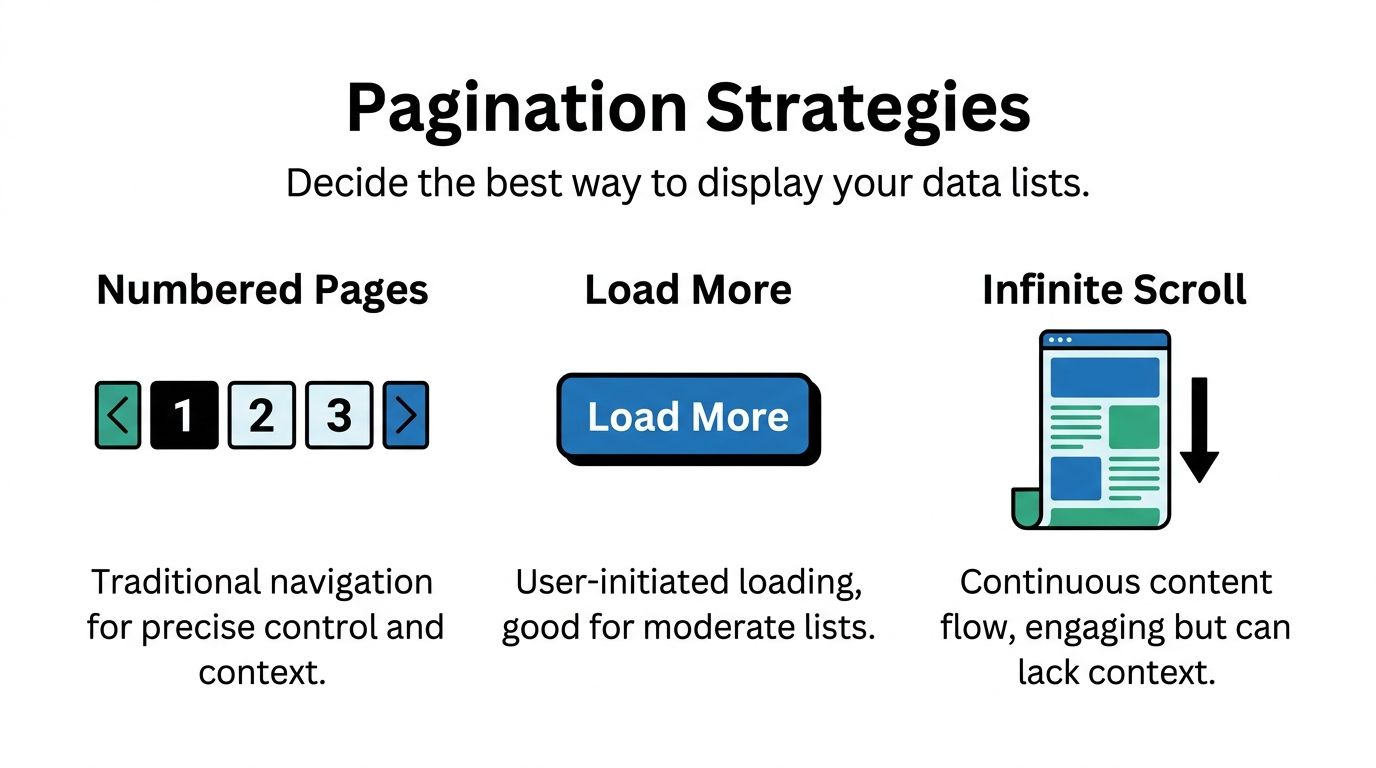
If users need precision, use a precise pattern. If users are browsing casually, use a lighter pattern. If your app is part content feed and part search tool, don’t pretend one approach will do both equally well.
A fast decision table
Pattern | Best for | Weakness | Bubble fit |
|---|---|---|---|
Numbered pages | Search, catalogs, admin tables | More clicks | Strong when users need control |
Load More | Marketplaces, directories, moderate browsing | Less exact position awareness | Often the best middle ground |
Infinite scroll | Feeds, inspiration, lightweight discovery | Harder orientation and recovery | Easy to misuse |
Numbered pages work when users are trying to find
Use numbered pages when users care about position, predictability, and revisiting a result set.
That includes:
E-commerce catalogs where filters and sorting matter
Directories with location, category, or status filters
Admin dashboards where someone needs to return to a specific slice of records
Search results where context matters
In Bubble, this usually means storing a page number in a custom state and calculating the current range. Your workflows become straightforward: next page, previous page, jump to page, reset to page one when filters change.
This pattern is also cleaner when you want better URL behavior or scroll restoration. If you need a smoother jump back to the result list after a user opens a detail page, a technique like scrolling the user back to the right place in Bubble can make the experience feel much less disjointed.
Use numbered pages when the user asks, “Where was that item?” Use something else when they never ask that question.
Load More is the best default more often than people expect
“Load More” works well when users want momentum without losing control.
For Bubble founders, this is often the sweet spot because:
it keeps the initial load lighter
it avoids the friction of hard page breaks
it doesn’t create the orientation problems of infinite scroll
it’s simple to explain and test
The setup is usually a custom state that controls how many items are shown. Each click increases that count. The repeating group updates. Done.
This works especially well for:
marketplaces
service directories
member lists
content libraries
filtered product lists
A notable point from the provided benchmark set is that 2026 no-code benchmarks describe a resurgence of “Show More” buttons for Stripe-integrated Bubble marketplaces, with up to 25% higher engagement than infinite scroll, while mobile slowdowns in infinite scroll setups are associated with 15-20% cart abandonment (NN Group alternatives to pagination listing pages). Treat the year framing carefully, but the product lesson is useful: in commerce-style apps, users often prefer control over endless motion.
Here’s the embedded walkthrough to compare common list behaviors in practice:
Infinite scroll works for feeds, not for everything
Infinite scroll is great when the content itself is the experience.
That’s why it fits:
social feeds
inspiration galleries
lightweight discovery views
activity streams
It’s weaker when users need anchors, comparison, or a reliable sense of progress. In Bubble, it can also create performance headaches if each batch includes media, conditional groups, or external data.
The biggest implementation mistake is using infinite scroll for a list that is a search result. Search is goal-oriented. Feeds are exploratory. Those are different behaviors.
A practical decision framework
If you’re stuck, use this:
Choose numbered pages if the user needs control, revisitability, and clear result boundaries.
Choose Load More if the user is browsing a moderate list and you want the simplest strong default.
Choose infinite scroll only if continuous discovery is the product behavior, not just a stylistic preference.
And one more rule matters. Match the items per page value to the pattern:
Numbered pages can stay tighter because the next step is obvious.
Load More should use an increment that feels meaningful but doesn’t create a visual jump.
Infinite scroll needs especially careful batch sizing so the page doesn’t become bloated as the session continues.
Implementing Advanced Pagination for APIs and Performance
Bubble gets more interesting when your list isn’t coming from the Bubble database at all.
A lot of useful MVPs pull records from Stripe, Airtable, custom backends, or internal APIs. In those cases, items per page becomes both a UI decision and an integration decision. If either side is off, the whole page feels brittle.
API pagination starts with the external service
When an API supports pagination, don’t fight it by trying to import giant payloads and handle everything in the browser. Use the API’s structure.
The common patterns are:
Limit and offset, where you ask for a count and a starting point
Cursor-based pagination, where the API returns a pointer to the next batch
Page-number schemes, which are simpler but less flexible on changing datasets
From the provided benchmark data, API pagination best practices suggest a default of 100 items per page with a max of 1,000, typically using parameters like limit. For Bubble’s API Connector, the same source suggests 25 items as a practical default for balancing mobile rendering and desktop throughput, and notes that this helps avoid timeouts when working with services like Stripe or Twilio (GetKnit API pagination best practices).
That doesn’t mean you should always show users 100 records. It means your integration can be flexible while your UI stays deliberate.
What that looks like in Bubble
For API-driven lists, I usually keep three pieces of state:
A page size or limit
A cursor or offset
A loading state
That gives you enough control to build Next, Previous, or Load More behavior without turning the page into workflow spaghetti.
If the API is cursor-based, store the returned cursor and request the next batch with it. If it’s offset-based, increment by your chosen batch size. Keep the display logic simple even if the backend mechanics are not.
For edge cases where the API response needs reshaping or the page needs scroll-aware behavior, some teams use custom code helpers. If you’re in that territory, this practical guide to using JavaScript alongside Bubble can help without turning your app into a full-code project.
The mistake isn’t using an API. The mistake is pretending API data can be handled exactly like local database data.
Database performance and pagination are linked
Even when you’re not calling an external API, advanced pagination still depends on how clean your data structure is.
A slow paginated list often points to one of these problems:
Nested searches inside cells
Too many calculated fields on page load
Poorly thought-out privacy rules
Mixed responsibilities in one repeating group
Sorting on unstable or awkward fields
Pagination can hide some of that pain, but it can’t solve bad architecture. If each cell triggers more searching, your page still pays for it.
A cleaner pattern is to do more work before the repeating group renders:
save denormalized display fields when appropriate
avoid searching for related records repeatedly inside every row
keep list cells focused on summary information
move deep detail into popups or dedicated pages
Choosing the right batch size for external data
Founders often overcorrect at this point.
They hear “APIs can handle more,” so they request large batches. Then the Bubble page has to parse and display too much data at once. The API may be fine. The front end isn’t.
A simple working rule:
Use case | Better default |
|---|---|
User-facing list on mobile | Smaller batch |
Dashboard with compact rows | Moderate batch |
Background sync or admin export flow | Larger batch |
Media-heavy cards | Smallest batch of all |
The right number depends on card complexity, not just record count.
SEO changes the pagination conversation
If your app has public-facing content, pagination isn’t only about speed. It affects discoverability and indexability.
Search-friendly pagination generally needs:
clear URL states
consistent ordering
content that can be reached without relying entirely on client-side behavior
careful handling of filtered pages
That’s especially relevant for Bubble apps that behave like single-page apps. If your public catalog or article index only works after heavy client-side interaction, search engines can miss or misread parts of it. This guide to SEO in single-page-style Bubble apps is useful when your list pages also need to rank.
The big picture is simple. Pagination is never just a front-end decoration. In Bubble, it sits right at the junction of API design, database structure, rendering cost, and discoverability.
Refining the User Experience and Ensuring Accessibility
A list can be technically paginated and still feel bad to use.
Good Bubble apps distinguish themselves here. The controls are clear, the mobile layout doesn’t collapse, the current state is obvious, and users who rely on assistive technology can move through the list without guessing.
Small UX details do most of the work
People don’t need a clever pagination control. They need one that answers basic questions fast:
Where am I?
How much is left?
What happens if I tap this?
Can I get back to where I was?
That means your interface should show context, not just controls.
Good examples include:
Current page indicators that are visually distinct
Result summaries such as a visible range display
Disabled states for previous and next when unavailable
Consistent placement so users don’t hunt for controls after every interaction
On mobile, keep controls large enough to tap comfortably and avoid tiny page links packed into one row. If the user has to zoom to change pages, the pattern is broken.
A polished list doesn’t just load fast. It explains itself fast.
Accessibility isn’t optional in pagination
This is a major weak spot in no-code builds.
The provided accessibility reference notes that 20% of the top websites have pagination errors detectable by screen readers, and highlights a common failure: page numbers that lack descriptive ARIA labels, which can create confusion for assistive technologies and risk issues with WCAG 2.1 Success Criterion 4.1.2 (a11ymatters pagination pattern).
In Bubble, that often shows up as pagination controls that look fine visually but announce almost nothing useful to a screen reader. “Link, 2” is not good enough. A user needs context such as whether that’s page 2, whether it’s the current page, and what activating it will do.
What to do in a no-code workflow
You don’t need to become an accessibility specialist to improve this. You do need to be deliberate.
Focus on these basics:
Wrap controls in a navigation landmark so assistive tech can identify the region.
Add descriptive labels to numbered buttons rather than leaving them as bare numbers.
Mark the current page clearly with state that both visual users and screen readers can interpret.
Keep focus behavior predictable after the user changes page or loads more records.
Avoid relying only on color to show active and inactive states.
If you’re reviewing your broader interface patterns, this resource on web accessibility best practices is a useful companion because pagination problems usually sit alongside button labeling, focus order, and semantic structure issues elsewhere in the app.
Responsive Engine choices matter here too
Bubble’s Responsive Engine can make pagination feel smooth or awkward depending on how you lay it out.
A few practical rules help:
Use rows for simple previous/next layouts when space is tight.
Collapse long page number sets on mobile rather than forcing every option to appear.
Keep “Load More” centered and obvious if that’s your chosen pattern.
Test horizontal and vertical views because control wrapping can create accidental overlap.
For public-facing pages, there’s also a search visibility angle. If your filtering and pagination create state changes that users can understand but crawlers can’t, you’ll end up with content that’s hard to discover. That’s one reason Bubble teams working on content-heavy apps should understand SEO for SPA-like experiences early instead of treating it as a launch-week task.
The apps that feel trustworthy usually get this part right. Users don’t notice accessibility and pagination when they work well. They notice immediately when they don’t.
From Clunky to Clean A Scalable Approach
The best pagination setup in Bubble depends on the job in front of the user.
That’s the main principle to keep. Not “always use infinite scroll.” Not “always use page numbers.” The right items per page strategy comes from the type of data, the user’s goal, and the performance budget of the page.
When a list is clunky, the cause is usually one of three things:
the repeating group is loading too much
the pagination pattern doesn’t match the task
the cell design is heavier than the app can support comfortably
Fixing only one of those helps. Fixing all three is what makes the app feel professional.
A simple way to think about it
Use this mental model when you’re building:
For finding, favor structured pagination.
For browsing, use Load More when you want balance.
For feed behavior, reserve infinite scroll for experiences that benefit from continuous discovery.
For API-backed data, let the backend pagination shape your front-end decisions.
For public pages, treat pagination as part of SEO and accessibility, not just interface polish.
What strong Bubble builds do differently
The cleaner apps don’t start by asking, “How do I paginate this repeating group?”
They start by asking:
What is the user trying to accomplish?
How much content can they reasonably scan?
What should the page load first?
What can wait until the next interaction?
Those questions lead to better technical decisions. They also reduce the amount of redesign work later, because your list logic grows from user behavior instead of from whatever the default plugin happened to support.
A scalable Bubble app doesn’t just store more data over time. It keeps feeling usable as that data grows. Pagination is one of the quiet systems that makes that possible.
Frequently Asked Questions About Bubble Pagination
Should I use a plugin or build pagination natively in Bubble
For most cases, build it natively first.
Bubble already gives you enough control with repeating groups, custom states, workflows, and conditional logic. Native setups are easier to debug, easier to adapt to your data model, and less likely to break when a plugin stops fitting your use case.
Plugins can help when:
You need a faster visual setup for basic page controls
Your team wants prebuilt UI states
You’re solving a common pattern with limited customization
Plugins become a problem when the app has complex filters, API-driven data, or unusual responsive behavior. In those cases, the plugin often becomes a black box sitting on top of a search you still need to understand.
My repeating group is paginated but still feels slow. What should I check first
Work through this in order.
Check the search itself If the data source is messy, pagination won’t save it. Look for nested searches, broad constraints, and sorting logic that should be simplified.
Inspect the cell design A paginated list with heavy cells can still perform badly. Images, conditional groups, and too many text calculations add up.
Review what loads on page load Popups, hidden groups, and supporting searches can make the whole page feel slow even if the list is paginated correctly.
Test mobile separately Responsive recalculation often exposes list issues much earlier than desktop testing.
Verify filters reset the page state correctly If users change a filter but stay on a later page or later offset, the results can appear broken or empty.
If page one is already sluggish, the issue usually isn’t the pagination control. It’s the cost of rendering each item.
How do I combine pagination with filters and sorting without breaking the UX
Tie them together through state, not through scattered workflows.
A clean setup usually includes:
One state for current page or current offset
One state for sort choice
A clear source of truth for active filters
A reset rule that returns the list to the first page whenever filters or sort order change
That last rule matters. If someone is on a later batch of results and then changes category, price range, or status, keeping them on the old page position often creates empty or misleading results.
Also keep sorting stable. If the sort field shifts unpredictably, users can see items move between pages. That makes the app feel unreliable even when the data is technically correct.
Is client-side pagination ever acceptable in Bubble
Yes, but only in narrow cases.
Client-side pagination is reasonable when the dataset is small, the records are lightweight, and the user benefits from instant local interactions. Internal tools with compact lists can sometimes get away with it.
It’s a poor choice when:
the list grows regularly
records contain images or lots of fields
the data changes frequently
users apply many filters
the source is an external API
If there’s any chance the list becomes central to the product, I’d lean toward a server-conscious approach early.
How should I choose items per page for different app types
Start from the task, not the database.
A few practical defaults work well:
Admin tables usually benefit from tighter pages because people are scanning for accuracy.
Marketplaces and directories often work better with moderate batches and a Load More pattern.
Feed-style experiences can use smaller continuous batches if the cards are simple.
API-driven lists should respect both the UI and the external service’s pagination model.
If you can’t decide, choose the smaller batch first and test how it feels. It’s easier to increase an items per page value later than to rescue a page that was built around overloading the interface.
What usually causes pagination bugs in Bubble
Most bugs come from state mismatches.
Typical examples include:
The page number updates but the search constraints do not
The sort changes but the offset does not reset
The result count changes but the next button still appears
The user loads more items but the scroll position becomes confusing
The API cursor changes but the previous cursor wasn’t stored properly
These aren’t hard engineering problems. They’re logic consistency problems. That’s why simple naming, clean workflow structure, and a single source of truth for list state matter so much.
Should public-facing Bubble pages use pagination differently from internal dashboards
Usually, yes.
Internal dashboards can prioritize efficiency for known users. Public pages need to consider discoverability, clarity, and accessibility more carefully. The pagination pattern should support the way first-time visitors explore content.
That often means:
clearer URLs
more stable sorting
stronger empty-state messaging
less reliance on purely dynamic interactions
more attention to labels and navigation semantics
Public pages also deserve stricter testing. If a founder can use the page because they already know the system, that doesn’t mean a new visitor can.
If you want help choosing the right pagination pattern for your Bubble app, or untangling a repeating group that’s dragging down performance, Codeless Coach offers one-to-one Bubble tutoring and consulting. It’s a practical way to work through list architecture, API pagination, Responsive Engine issues, and real MVP trade-offs with someone who’s built and shipped Bubble apps before.